Optimal viewing distance for bigger screens will be 10 feet or more, so they are called as 10 Feet TV UI. Creating and testing designs for 10 feet UI comes with unique challenges and scope for opportunities to better the experience.
Problem Statement
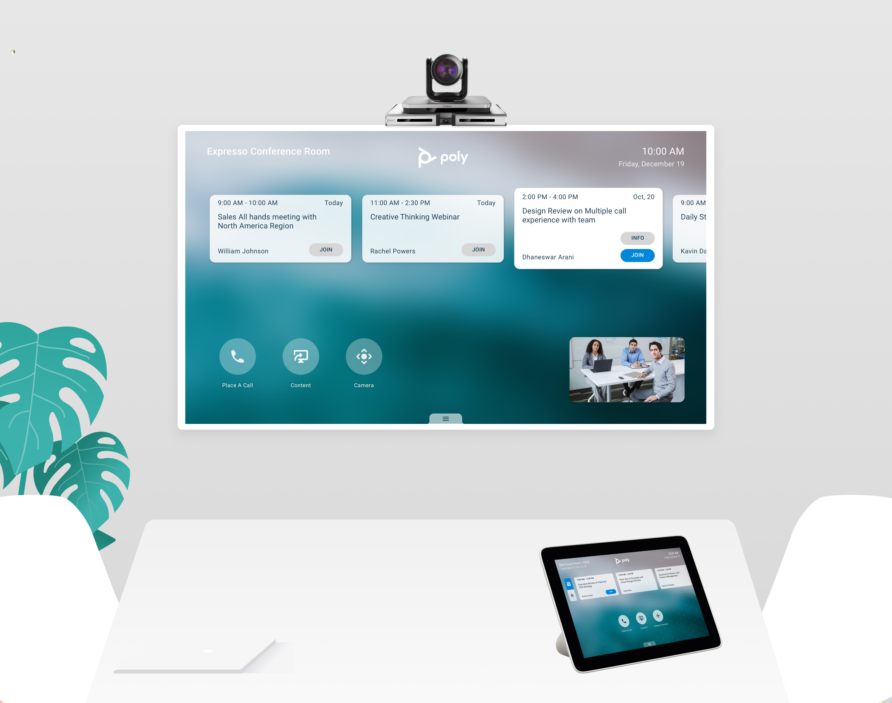
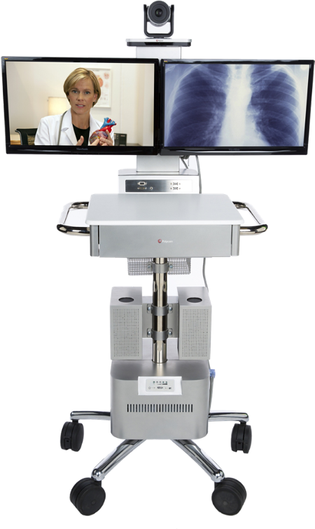
Daily Thousands of Humans around the world experience the Video Conferencing worldwide. Best experience lies in simple design of complex workflows. Especially with telemedicine is life saving in extreme situations like COVID-19 or pandemics, Quality medical advice can reach to different corners of the world in no time. GroupSeries have a few features like acoustic fencing, camera auto tracking and detecting active speaker.
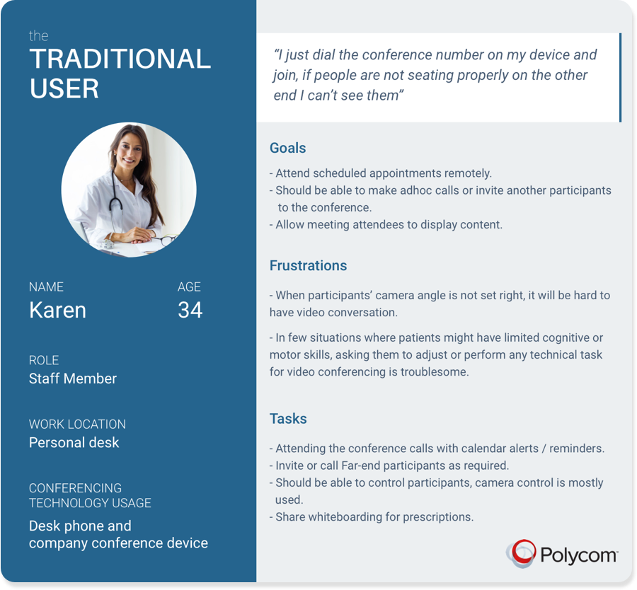
By understanding customers real-time scenario we found operating video conference at patients room becoming tedious as each patient is different and the limitations vary a lot, it can be either motor or cognitive. As of now doctors has to remotely guide patients how to operate device in majority of cases, whether it’s setting right camera angle or managing the device to attend a call. It becomes much complicated in operation theatres when patient or doctor in service who can’t handle the VC.
Analysis
First thing, I started looking at the different personas those defined for this product. What participants do in multi-point conference call? How host features is different from participants? Which environments they use? In Addition, I worked on comptetitive analysis with similar product lines with-in organisation, competitiors and partners like CISCO, Skype for Business and Zoom works. This gave a high level understanding on how patterns are defined, are there any standard or universal patterns followed across.
User Flows
Initial Draft Wireframes
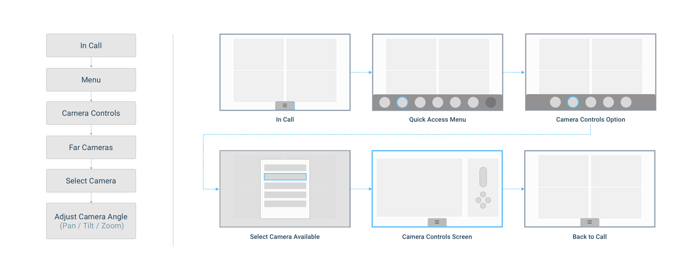
Performed user research with draft designs and validated the concept. First instinct, with list of Far participant cameras under cameras menu. But usability testing gave us a different result, What went wrong ? Users tend to look for participants whom they want to control. Firstly, Camera selection to adjust Far-end cameras is grouped under camera controls menu along with other camera options. Secondly, the order of the action keys displayed. Participants list comes earlier than Camera controls in the sequence of linear navigation performed via remote, which weigh up participants section to look for respective camera. Another user painpoint, is 9 key strokes to launch list of cameras.
Proposed Solution
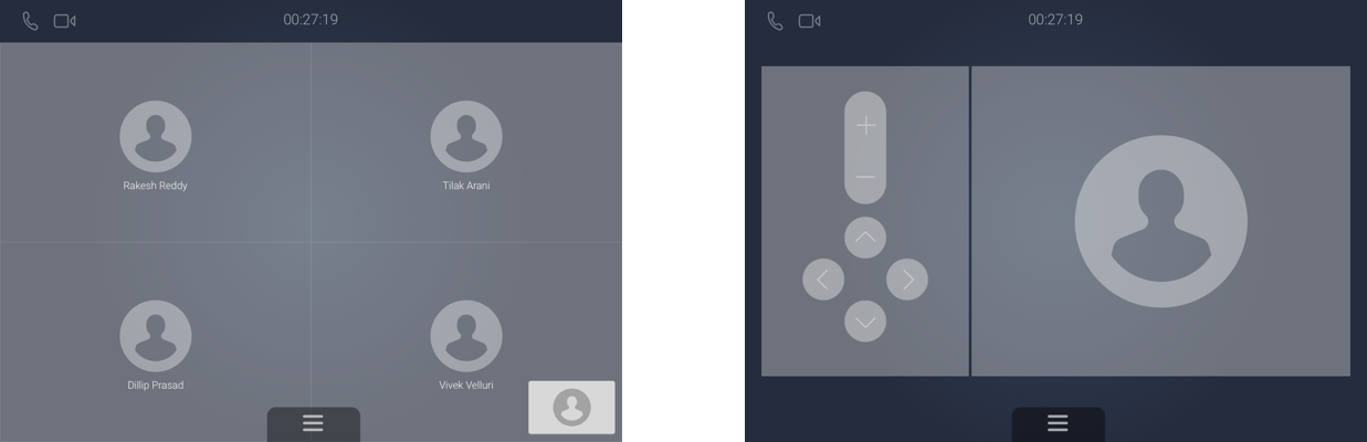
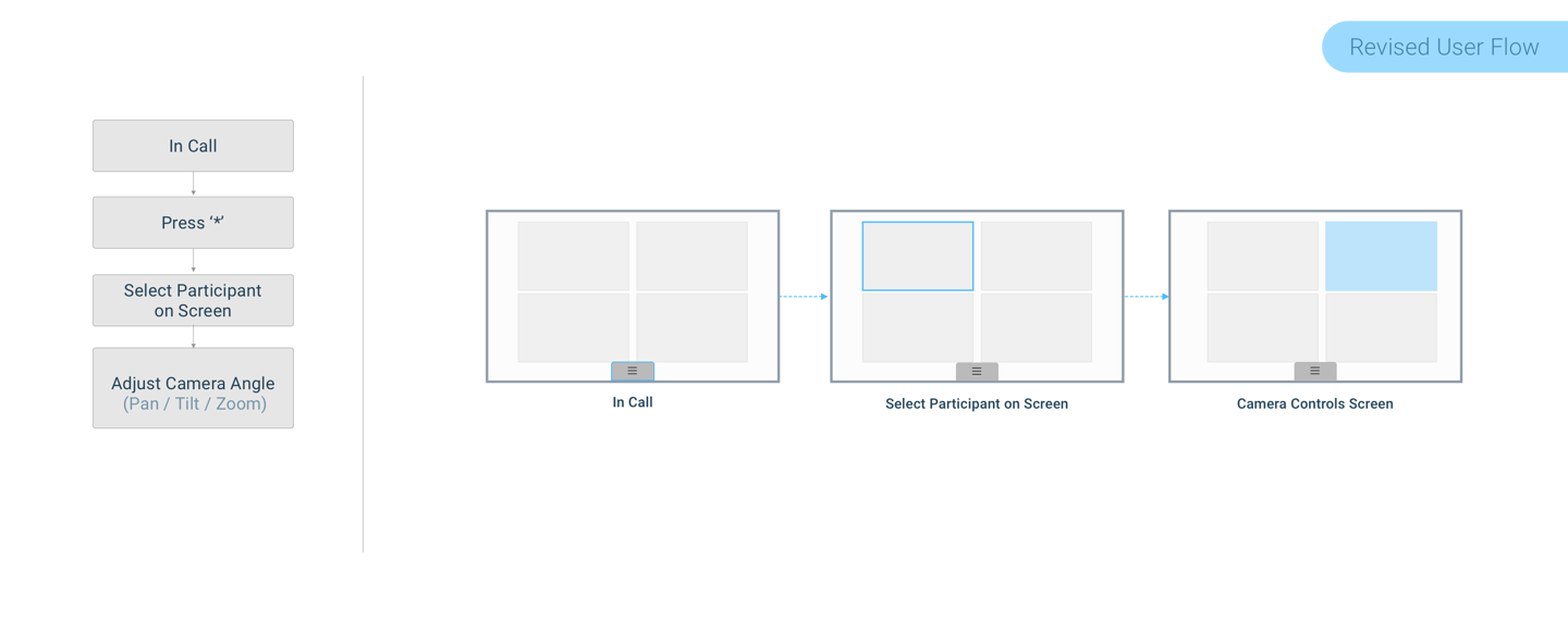
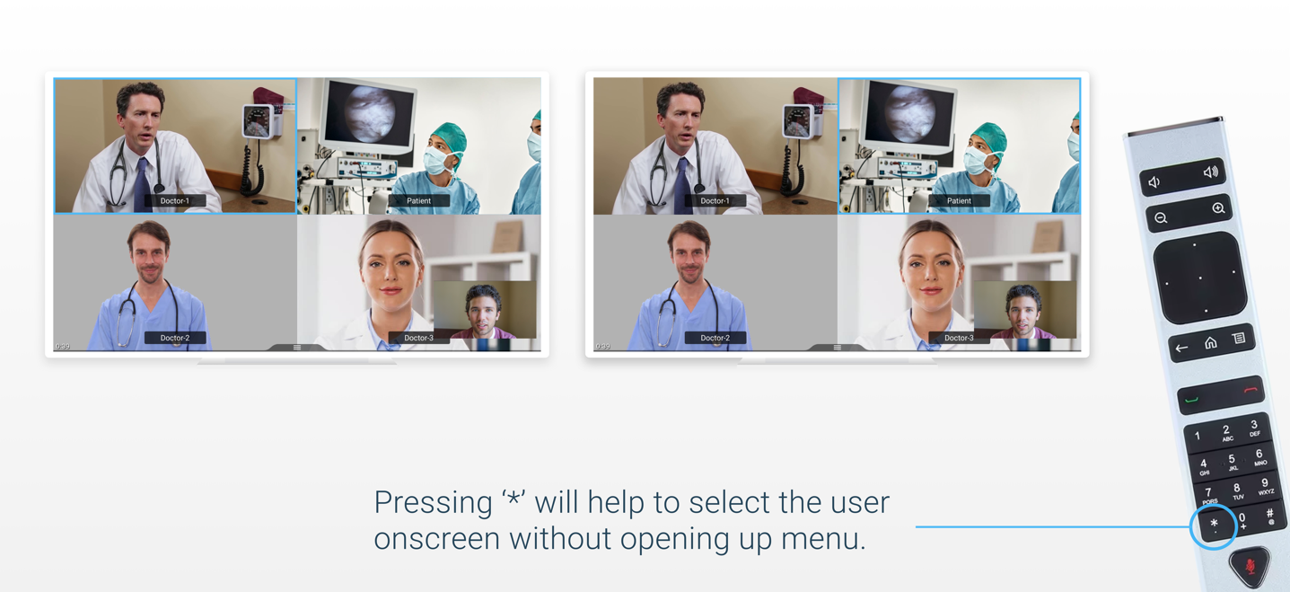
Proposed changes after multiple iterations and review, the final solution includes selecting far-participant directly from the view instead navigating into menu options. Achieved by providing a simple short cut functionality on remote, pressing ‘*’ highlights and navigate through far-end participants and from there user can control respective camera without opening up menu section. This reduced number of key strokes from earlier 9 to 2.
We didn’t stop there, to educate long press ‘*’ feature we displayed an information tip when user try to navigate via traditional way under participants / cameras as first time user guide.
New design Impact on users are quiet visible on device statistics, usage of ‘*’ is widely adapted by users during the call. This indicates they are using Far-participant camera control with new proposed solution more than traditional way of menu selection. This feature eventually helped sales executives to penerate further in Health Sciences Industry.
Myth, hidden features won’t work. FACT, easy to adapt designs will quickly overcome and become part of usage subconsciously even if it’s not visible at first. Providing right information and notifying the current state of the machine will conjure the feature.
Working on Groupseries and supported controls devices is a learning experience which I continue to practice and share for best 10 Foot UI designs. Here are the major takeaways
- Remote controls are very simple input devices, better to avoid asking users to type username or passwords or any long texts. Keep important information at centre so need for navigation will be less.
- Focus states are very important as there won’t be a mouse pointer. Simple frame or border to highlight and micro interactions when focused will be good differentiator.
- Always use SVG format for icons, vector images will scalable to any screen sizes
- Ideate more on features like recently, upcoming and most frequently used activities.
- Use the screen real-estate advantage effectively, rather than deep navigation patterns can display information on demand with appropriate visual hierarchy.
- Utilise Noise cancellation when voice command feature activated, so that background sound or voices won’t interfere with user voice commands. If Noise cancellation feature not available we can go with simplest solution of lowering the TV volume automatically when Voice Command activated.
- Better to design UI that support touch experience, so it support large touch screen enabled displays that are placed in seminar or presentation rooms. Users can navigate without remote.